Q-Q, Swarm, Rug, Strip, Stacked, and Rigeline Plots
Q-Q Plots
There might be cases where you are interested to see how closely your numeric data follows some hypothetical distribution. This might be important for certain parametric statistical tests, like checking for assumptions of normality. In cases like this, you can use a quantile-quantile plot, or Q-Q plot, to make a visual comparison between your data and your reference distribution. Take for example the following comparison of the following data and a hypothetical normal distribution using the sample statistics:
# create a histogram of the data
bin_size = 0.5
bin_edges = np.arange(4, 18 + bin_size, bin_size)
plt.hist(data = df, x = 'num_var', bins = bin_edges);

# overlay a theoretical normal distribution on top
samp_mean = df['num_var'].mean()
samp_sd = df['num_var'].std()

from scipy.stats import norm
x = np.linspace(4, 18, 200)
y = norm.pdf(x, samp_mean, samp_sd) # normal distribution heights
y *= df.shape[0] * bin_size # scale the distribution height

plt.plot(x, y)
The matplotlib plot function is a generic function for plotting y-values against x-values, by default a line connecting each x-y pair in sequence. In this case, I first use numpy's linspace function to generate x-values across the range of the plot. Note that the first two arguments match the bin_edgeslimits, while the third argument specifies the number of values to generate between the two endpoints. Then, I use the scipy package's norm class to get the height of the normal distribution curve at those x-values, using the sample mean and standard deviation as distribution parameters. pdf stands for probability density function, which returns the normal distribution height (density) at each value of x. These values are such that the total area under the curve will add up to 1. Since we've got a histogram with absolute counts on the y-axis, we need to scale the curve so it's on the same scale as the main plot: we do this by multiplying the curve heights by the number of data points and bin size. The code above gives us the following plot:

From a visual inspection of this overlaid plot, it looks like the data is a bit sparse on the right side compared to the expected normal distribution. There's also a bit of a spike of values between 11 and 12. On the other hand, the left side of the curve isn't too far off from the expected distribution, though it might be said that we might be missing some expected points in the left tail of the distribution. The question that we'd like to address is if there's enough evidence from what we've observed to say that the data is significantly different from the expected normal distribution.
One way we could approach this is through a statistical test, such as using scipy's shapiro function to perform the Shapiro-Wilk test. But since this is a course on data visualization, we'll inspect this question visually, using the Q-Q plot type teased at the top of the page. The main idea of the plot is this: if the data was normally distributed, then we'd expect a certain pattern in terms of how far each data point is from the mean of the distribution. If we order the points from smallest to largest, then we could compare how large the _k_-th ranked data point is against the _k_-th ranked point from the expected distribution.

It's a good idea to label the axes in this case. Since the actual and expected data are both on the same scale, the labels are a big help to keep things clear. In addition, rather than just plotting the expected and actual data alone, I've also added another plot call to add a diagonal x = y line. If the data matches the actual values perfectly on the expected value, they will fall directly on that diagonal line. The plt.axis('equal') line supports the visualization, as it will set the axis scaling to be equal, and the diagonal line will be at a 45 degree angle.

Excepting the smallest and largest few points, the distribution of observed values is actually fairly in line with the distribution of expected values – that is, it falls along the diagonal line. The smallest and largest observed points are larger than the values that would be expected from the normal distribution, but it's not by much. Given how much farther values can get spread out in the tails of the normal distribution, this shouldn't be a major concern. We're probably fine in treating the data as normally distributed.
Usually, the Q-Q plot is computed and rendered in terms of standardized units, rather than the scale of the original data. A standardized dataset has a mean of 0 and standard deviation of 1, so to convert a set of values into standard scores, we just need to subtract the sample mean from each value to center it around 0, then divide by the sample standard deviation to scale it. Calling methods of the norm class without arguments for the mean or standard deviation assume the standard normal distribution. The code changes as follows:

Notice that the shape of the data has not changed since both datasets have been scaled in the exact same way. One of the reasons for performing this scaling is that it makes it easier to talk about the data values against the expected, theoretical distribution. In the first plot, there's no clear indication of where the center of the data lies, and how spread out the data is from that center. In the latter plot, we can use our expectations for how much of the data should be one or two standard deviations from the mean to better understand how the data is distributed. It also separates the values of the theoretical distribution from any properties of the observed data.
Before closing this page out, let's take a quick look at the Q-Q plot when the data distribution does notfit the normal distribution assumptions. Instead of generating data from a normal distribution, I'll now generate data from a uniform distribution:

When we compare the random standardized scores drawn from the uniform distribution to the expected scores from the theoretical normal distribution in the Q-Q plot, we see an S-shaped curve. The comparison of values in the middle of the curve are approximately linear in trend, but the slope is steeper than the desired y = x. Meanwhile on the edges, the slope is extremely shallow, as the uniform distribution is fixed to a finite range, but the normal distribution values in the tails are expected to be much further away. You can somewhat see this in the superimposed distribution line in the left-side plot, where even at the edges of the data, there is still quite a bit of height to the theoretical normal curve. All of this contributes to the result that the randomly-generated uniform data can't be well-approximated by the normal distribution.
Swarm Plots
Swarm Plots
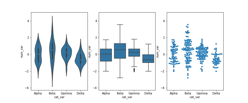
In this lesson, you saw many ways of depicting the relationship between a numeric variable and a categorical variable. Violin plots depicted distributions as density curves, while box plots took a more summary approach, plotting the quantiles as boxes with whiskers. Another alternative to these plots is the swarm plot. Similar to a scatterplot, each data point is plotted with position according to its value on the two variables being plotted. Instead of randomly jittering points as in a normal scatterplot, points are placed as close to their actual value as possible without allowing any overlap. A swarm plot can be created in seaborn using the swarmplot function, similar to how you would a call violinplot or boxplot.
Looking at the plots side by side, you can see relative pros and cons of the swarm plot. Unlike the violin plot and box plot, every point is plotted, so we can now compare the frequency of each group in the same plot. While there is some distortion due to location jitter, we also have a more concrete picture of where the points actually lie, removing the long tails that can be present in violin plots.
However, it is only reasonable to use a swarm plot if we have a small or moderate amount of data. If we have too many points, then the restrictions against overlap will cause too much distortion or require a lot of space to plot the data comfortably. In addition, having too many points can actually be a distraction, making it harder to see the key signals in the visualization. Use your findings from univariate visualizations to inform which bivariate visualizations will be best, or simply experiment with different plot types to see what is most informative.
Rug and Strip Plots
Rug and Strip Plots
You might encounter, or be interested in, marginal distributions that are plotted alongside bivariate plots such as scatterplots. A marginal distribution is simply the univariate distribution of a variable, ignoring the values of any other variable. For quantitative data, histograms or density curves are fine choices for marginal plot, but you might also see the rug plot employed. In a rug plot, all of the data points are plotted on a single axis, one tick mark or line for each one. Compared to a marginal histogram, the rug plot suffers somewhat in terms of readability of the distribution, but it is more compact in its representation of the data.
Seaborn's JointGrid class enables this plotting of bivariate relationship with marginal univariate plots for numeric data. The plot_joint method specifies a plotting function for the main, joint plot for the two variables, while the plot_marginals method specifies the plotting function for the two marginal plots. Here, we make use of seaborn's rugplot function.
The "height" parameter specifies the rug ticks to be 0.25 the height of the marginal axis size.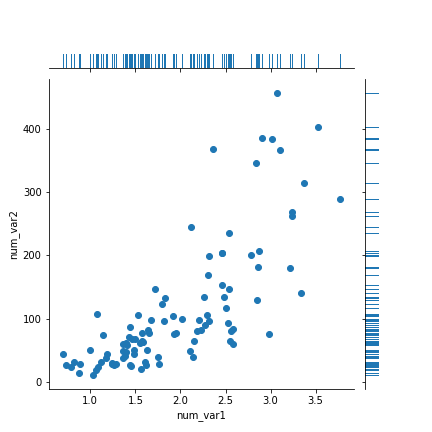
The rug plot is fine here since the data isn't particularly numerous or overly dense. In other circumstances, a histogram or density curve will be more appropriate. You probably won't consider the rug plot as a primary plot choice, but it can be a good supporter plot in certain circumstances.
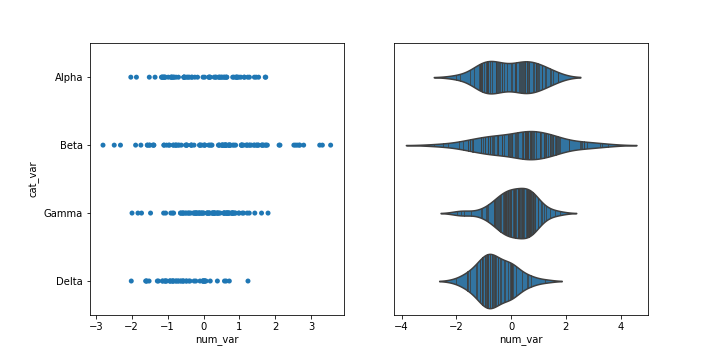
Another supporting plot type similar to the rug plot is the strip plot. It's like a swarm plot (see the previous page) but without any dodging or jittering to keep points separate or off the categorical line. You can also think of it as a rug plot faceted by categorical levels. You can use seaborn's swarmplotfunction to add a swarm plot to any other plot. The inner = "stick" and inner = "point" options can also be used with the violinplot function to include a swarm plot inside of the violin areas, instead of a box plot.
Stacked Plots
One common plotting technique has not been discussed thus far in the course, and that’s stacking. Stacked bar charts and histograms are not uncommon, but there are often better plot choices available.
The most basic stacked chart takes a single bar representing the full count, and divides it into colored segments based on frequencies on a categorical variable. If this sounds familiar, that's because it almost perfectly coincides with the description of a pie chart, except that the shape being divided is different.
The stacked bar is built through successive calls of the matplotlib barh function; each time the function is called, the bar that is plotted is assigned a new color. The choice of "y" is arbitrary: it'll just center the bar around y = 1, but it doesn't have any inherent meaning. The "left" parameter specifies the left edge of each bar added to the stack, which starts at the baseline of 0 and is built up with each stacked bar. Note in this case that the bar is being plotted with absolute counts, rather than proportions. A discussion of absolute vs. relative frequencies will come later down the page!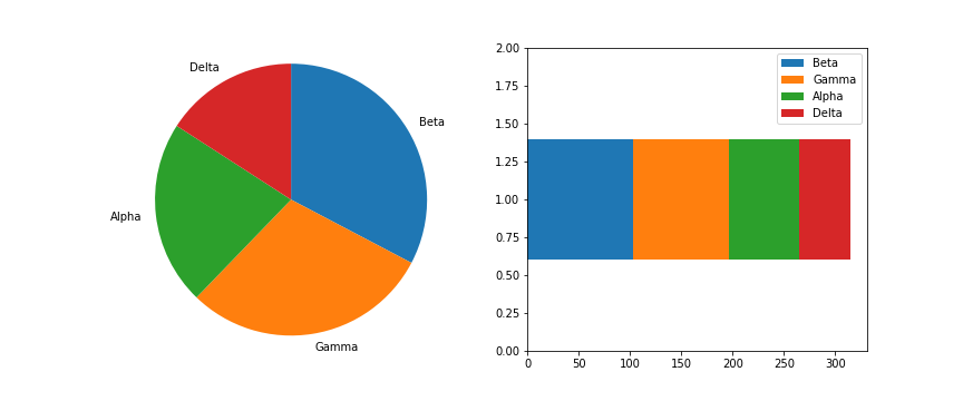
Given this similarity, cautions regarding use of the stacked bar are fairly similar to that of the pie chart:
Make sure that relative frequencies are a meaningful comparison.
Try to limit yourself to a small number of categories, up to about five.
Make sure that categories are arranged in a sensible order, e.g. by frequency for nominal data or by levels for ordinal data.
Otherwise, the standard bar chart is a reliable option that should be used in most cases. Only use the pie chart or singly divided bar if there's a compelling reason to do so.
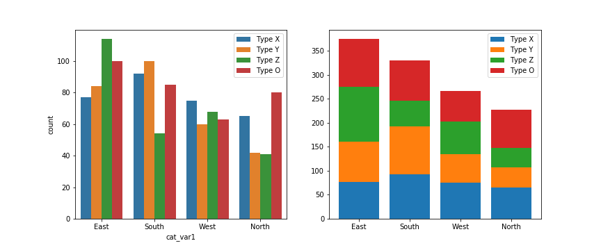
The debate becomes more interesting when multiple features get involved. When should we feel free to create a stacked bar chart versus using a clustered bar chart? There are two major categories of stacked bar chart that I want to focus on here: plotting by absolute frequency and plotting by relative frequency. We'll start with code for an absolute frequency stacked chart below.
The strategy for this plot is very similar to the single stacked bar shown above, except that we're using the standard bar with "x" and "bottom" parameters, and that baselines is a list of base heights. We want to create all of the bars for a particular secondary category at the same time so that creation of the legend has a 1:1 mapping to bar calls. You might notice below that the order of labels in the legend is the reverse of the order in which the bars are stacked. You'll see code to handle this in the relative frequency plot below!
The stacked bar chart plotted by absolute frequency carries one big advantage over the clustered bar chart: for the variable plotted on the x-axis, it's clear which category level has the highest frequency, in this case "East". The values of this variable can be interpreted just like the univariate bar chart. The disadvantage of the stacked bar chart comes with interpretation of the second, stacked variable. If you want to compare the relative counts of this second variable across levels of the first, you can really only do that for the category plotted on the baseline, which in this case is the blue one, "Type X". For the remaining categories, it's much harder to make the comparison of values – you can't really tell that the counts of "Type O" are larger in the "South" than the "North" from the stacked chart, where it's directly comparable in the clustered bar chart.
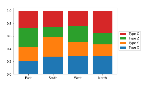
Now, let's take a look at what happens when we create the stacked bar chart with relative frequencies instead, where each bar is scaled to a total height of 1.
There are two main changes to this code compared to the previous plot. First of all, the cat1_countsvariable has been computed to change the absolute frequencies into relative frequencies within each x-axis category. Secondly, some code has been added to reverse the order of bars in the legend. The artists variable has been added to store references to each of the bar groups added from each barcall. Then in the legend function call, we make use of the built-in Python function reversed to reverse the order in which the artists and labels are included in the legend. The additional parameters affect the positioning of the legend: setting an anchor for the legend box on the right side of the plot via "bbox_to_anchor", and positioning the anchor to the legend's left with "loc = 6".
Since the bars are all the same height of 1 with a relative frequency stacked bar chart, we lose the ability to compare the absolute counts on the categorical variable plotted on the x-axis (i.e. we can't tell that "East" has the most counts and "North" the least amount). In exchange, we can now compare the relative prevalence of the stacked variable on both the first category on the bottom ("Type X") as well as the category on the top ("Type O"). We can now see that, in terms of relative frequency, "Type X" has a fairly consistent presence in "South", "West", and "North", and that "Type O" has its highest relative frequency in "North". Unfortunately, this still doesn't help us make easy comparisons about the "Type Y" and "Type Z" categories that are sandwiched in between. This major limitation is a big reason why other plot types like clustered bar or line charts are often preferable to stacking.
Further Reading
Eager Eyes: Stacked Bars are the Worst
Data Revelations: How to take the “screaming cats” out of stacked bar and area charts
Rideline Plots
Ridgeline Plots
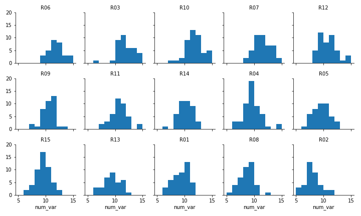
One of the hot new visualization types from recent years is the ridgeline plot. In a nutshell, the ridgeline plot is a series of vertically faceted line plots or density curves, but with somewhat overlapping y-axes. This can be thought of as a contrast to the line plot variation seen in the "Line Plots" part of the lesson, where multiple lines were plotted on the same axes, with different hues. On this page, I'll walk through the creation of a ridgeline plot using some of the demonstration data shown in the "Faceting" page:
Faceted plot, whose data will be converted into a ridgeline form
Two things immediately come to mind for changing the faceted histograms into a ridgeline plot. First of all, changing the form of the distribution plots from histograms to kernel density estimates (as seen in the Extras of the previous lesson) will make the overlaps a bit smoother. Second, we need to facet the levels by rows so that they're all stacked up on top of one another.
FacetGrid and set_titles change "col" to "row", also removing "col_wrap". The "size" and "aspect" dimensions have also been adjusted for the large vertical stacking of facets. The map function changes to kdeplot and removes "bins", adding the "shade" parameter in its place.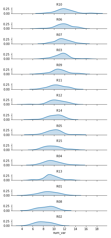
Now we've got all of the group distributions stacked on top of one another for a uni-dimensional comparison, but the plot's still pretty tall. Next, we'll create some overlap between the individual subplots.
I've added the "gridspec_kws" parameter to the FacetGrid call to adjust the arrangement of subplots in the grid through Matplotlib's GridSpec class. By setting "hspec" to a negative value, the subplot axes bounds will overlap vertically. The "size" and "aspect" parameters have also been adjusted. While I'm at it, I'll add some code on the FacetGrid object to remove the y-axis through the despine method and remove the ticks through the set method. They're going to start overlapping, and we don't really need them – we're mostly interested in the relative positions of the distributions rather than specific heights.
The individual subplots now overlap, but we've still got a problem: the backgrounds of the subplots are opaque, thus obscuring all but the tops of all of the individual group distributions, with the exception of the lowest. In addition, the individual subplot titles overlap the other distributions with some ambiguity: these should be moved elsewhere in the individual plots. The revised code and plot look like this:
We make clever use of the FacetGrid object's map function to perform the plot modifications. Previously, you've seen map used where the first argument is a plotting function, the following arguments are positional variable strings, and any additional arguments are keyword arguments for the plotting function. In actuality, you can set any function as the first argument, which will be applied to each facet. To apply the transparency using map, I set up an anonymous lambda function that gets the current Axes (gca), selects its background (patch), and sets its transparency to full.
As for the second map argument, it sends a pandas Series to the function specified by the first argument. This Series is filtered to include only the column specified by the second map argument, with only the rows appropriate for each facet. In this case, I exploit the fact that the 'many_cat_var' column is filled with copies of the categorical feature string to specify the text string, with hardcoded positional values appropriate to the plot. (map also sends a few general keyword arguments like 'color' automatically to the specified function, hence the need for **kwargs to capture them despite not specifying any myself.) One downside to this approach is that the x-axis labels get replaced with 'many_cat_var' after the map call, thus requiring the addition of a set_xlabels function call to reset the string.
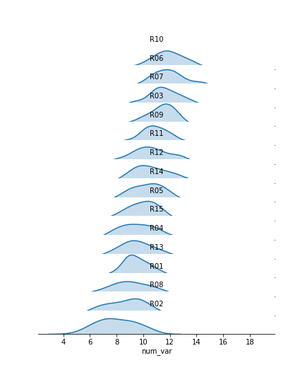
The final ridgeline plot looks like this, where we can see the distribution of our numeric variable on each category, sorted by mean: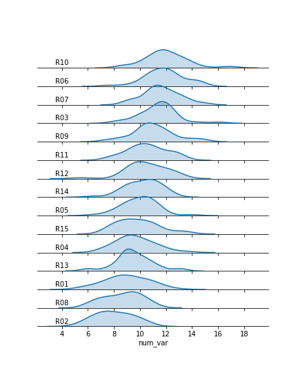
Further Reading
Seaborn: ridge plot example - I actually used this example to clean up my initial attempts. It's got a little bit more aesthetic cleaning than the above demonstration.
Last updated
Was this helpful?
