Data Viz Cheat Sheet
Figures, Axes, Subplots
plt.figure(figsize = [10, 5]) # larger figure size for subplots
# example of somewhat too-large bin size
plt.subplot(1, 2, 1) # 1 row, 2 cols, subplot 1
bin_edges = np.arange(0, df['num_var'].max()+4, 4)
plt.hist(data = df, x = 'num_var', bins = bin_edges)
# example of somewhat too-small bin size
plt.subplot(1, 2, 2) # 1 row, 2 cols, subplot 2
bin_edges = np.arange(0, df['num_var'].max()+1/4, 1/4)
plt.hist(data = df, x = 'num_var', bins = bin_edges)
plt.xlim(0, 35)
plt.xticks(np.arange(2, 12+1, 1))
Base Color and Order
# Use only 1 color because other colors give no extra meaning
base_color = sb.color_palette()[0]
sb.countplot(data = df, x = 'cat_var', color = base_color)
# Sort the data by highest / lowest value
cat_order = df['cat_var'].value_counts().index
sb.countplot(data = df, x = 'cat_var', color = base_color, order = cat_order)
# Order with ordinal categories
# this method requires pandas v0.21 or later
level_order = ['Alpha', 'Beta', 'Gamma', 'Delta']
ordered_cat = pd.api.types.CategoricalDtype(ordered = True, categories = level_order)
df['cat_var'] = df['cat_var'].astype(ordered_cat)
Get proportions or relative frequencies
# get proportion taken by most common group for derivation
# of tick marks
n_points = df.shape[0]
max_count = df['cat_var'].value_counts().max()
max_prop = max_count / n_points
# generate tick mark locations and names
tick_props = np.arange(0, max_prop, 0.05)
tick_names = ['{:0.2f}'.format(v) for v in tick_props]
# create the plot
base_color = sb.color_palette()[0]
sb.countplot(data = df, x = 'cat_var', color = base_color)
plt.yticks(tick_props * n_points, tick_names)
plt.ylabel('proportion')
Use text annotations to label the frequencies on bars
# create the plot
base_color = sb.color_palette()[0]
sb.countplot(data = df, x = 'cat_var', color = base_color)
# add annotations
n_points = df.shape[0]
cat_counts = df['cat_var'].value_counts()
locs, labels = plt.xticks() # get the current tick locations and labels
# loop through each pair of locations and labels
for loc, label in zip(locs, labels):
# get the text property for the label to get the correct count
count = cat_counts[label.get_text()]
pct_string = '{:0.1f}%'.format(100*count/n_points)
# print the annotation just below the top of the bar
plt.text(loc, count-8, pct_string, ha = 'center', color = 'w')
Bins
bin_edges = np.arange(0, df['skew_var'].max()+2.5, 2.5)
plt.hist(data = df, x = 'skew_var', bins = bin_edges)
Scales and Transformations (Log)
bin_edges = 10 ** np.arange(0.8, np.log10(data.max())+0.1, 0.1)
plt.hist(data, bins = bin_edges)
plt.xscale('log')
tick_locs = [10, 30, 100, 300, 1000, 3000]
plt.xticks(tick_locs, tick_locs)
Jitter, Transparency and Overplotting
# Transparency
plt.scatter(data = df, x = 'disc_var1', y = 'disc_var2', alpha = 1/5)
As an alternative or companion to transparency, we can also add jitter to move the position of each point slightly from its true value. This is not a direct option in matplotlib's scatter
function, but is a built-in option with seaborn's regplot
function (setting alpha is different as well):
sb.regplot(data = df, x = 'disc_var1', y = 'disc_var2', fit_reg = False,
x_jitter = 0.2, y_jitter = 0.2, scatter_kws = {'alpha' : 1/3})
Heatmap
default "viridis" color palette, by setting cmap = 'viridis_r'.
By adding a cmin = 0.5
parameter to the hist2d
call, this means that a cell will only get colored if it contains at least one point.
bins_x = np.arange(0.5, 10.5+1, 1)
bins_y = np.arange(-0.5, 10.5+1, 1)
plt.hist2d(data = df, x = 'disc_var1', y = 'disc_var2',
bins = [bins_x, bins_y], cmap = 'viridis_r', cmin = 0.5)
plt.colorbar()
# loop through the cell counts and add text annotations for each
for i in range(counts.shape[0]):
for j in range(counts.shape[1]):
c = counts[i,j]
if c >= 7: # increase visibility on darkest cells
plt.text(bins_x[i]+0.5, bins_y[j]+0.5, int(c),
ha = 'center', va = 'center', color = 'white')
elif c > 0:
plt.text(bins_x[i]+0.5, bins_y[j]+0.5, int(c),
ha = 'center', va = 'center', color = 'black')
Legend
ax.legend(loc = 8, ncol = 3, framealpha = 1, title = 'cat_var2')
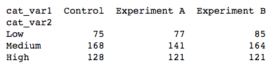
2 Categorical Variables
sb.countplot(data = df, x = 'cat_var1', hue = 'cat_var2')
Heatmap: Instead of providing the original dataframe, we need to summarize the counts into a matrix that will then be plotted.
ct_counts = df.groupby(['cat_var1', 'cat_var2']).size()
ct_counts = ct_counts.reset_index(name = 'count')
ct_counts = ct_counts.pivot(index = 'cat_var2', columns = 'cat_var1', values = 'count')
(Documentation: Series reset_index
, DataFrame pivot
)
sb.heatmap(ct_counts)

sb.heatmap(ct_counts, annot = True, fmt = 'd')
annot = True
makes it so annotations show up in each cell, but the default string formatting only goes to two digits of precision. Adding fmt = 'd'
means that annotations will all be formatted as integers instead. You can use fmt = '.0f'
if you have any cells with no counts, in order to account for NaNs.
Faceting
group_means = df.groupby(['many_cat_var']).mean()
group_order = group_means.sort_values(['num_var'], ascending = False).index
g = sb.FacetGrid(data = df, col = 'many_cat_var', col_wrap = 5, size = 2,
col_order = group_order)
g.map(plt.hist, 'num_var', bins = np.arange(5, 15+1, 1))
g.set_titles('{col_name}')
Line Plots
# set bin edges, compute centers
bin_size = 0.25
xbin_edges = np.arange(0.5, df['num_var1'].max()+bin_size, bin_size)
xbin_centers = (xbin_edges + bin_size/2)[:-1]
# compute statistics in each bin
data_xbins = pd.cut(df['num_var1'], xbin_edges, right = False, include_lowest = True)
y_means = df['num_var2'].groupby(data_xbins).mean()
y_sems = df['num_var2'].groupby(data_xbins).sem()
# plot the summarized data
plt.errorbar(x = xbin_centers, y = y_means, yerr = y_sems)
plt.xlabel('num_var1')
plt.ylabel('num_var2')
Adapted Bar Plot
we could plot a numeric variable against a categorical variable by adapting a bar chart so that its bar heights indicate the mean of the numeric variable. This is the purpose of seaborn's barplot
function:
base_color = sb.color_palette()[0]
sb.barplot(data = df, x = 'cat_var', y = 'num_var', color = base_color)
Different hues are automatically assigned to each category level unless a fixed color is set in the "color" parameter, like in countplot
and violinplot
.

Encoding via shape
cat_markers = [['A', 'o'],
['B', 's']]
for cat, marker in cat_markers:
df_cat = df[df['cat_var1'] == cat]
plt.scatter(data = df_cat, x = 'num_var1', y = 'num_var2', marker = marker)
plt.legend(['A','B'])

Encoding via size
plt.scatter(data = df, x = 'num_var1', y = 'num_var2', s = 'num_var3')
# dummy series for adding legend
sizes = [20, 35, 50]
base_color = sb.color_palette()[0]
legend_obj = []
for s in sizes:
legend_obj.append(plt.scatter([], [], s = s, color = base_color))
plt.legend(legend_obj, sizes)
Encoding via color
If you have a qualitative variable, you can set different colors for different levels of a categorical variable through the "hue" parameter on seaborn's FacetGrid class.
g = sb.FacetGrid(data = df, hue = 'cat_var1', size = 5)
g.map(plt.scatter, 'num_var1', 'num_var2')
g.add_legend()

For quantitative variables, we should not take the same approach, since FacetGrid expects any variable input for subsetting to be categorical. Instead, we can set color based on numeric value in the scatter
function through the "c" parameter, much like how we set up marker sizes through "s". (Unlike with size, we don't have an easy way of setting color by numeric value through regplot
due to how its "color" argument is set up.)
plt.scatter(data = df, x = 'num_var1', y = 'num_var2', c = 'num_var3')
plt.colorbar()

Faceting for multivariate data
Where the faceted plots demonstrated were univariate before, you can actually use any plot type, allowing you to facet bivariate plots to create a multivariate visualization.
g = sb.FacetGrid(data = df, col = 'cat_var1', size = 4)
g.map(sb.boxplot, 'cat_var2', 'num_var2')

FacetGrid also allows for faceting a variable not just by columns, but also by rows. We can set one categorical variable on each of the two facet axes for one additional method of depicting multivariate trends.
g = sb.FacetGrid(data = df, col = 'cat_var2', row = 'cat_var1', size = 2.5,
margin_titles = True)
g.map(plt.scatter, 'num_var1', 'num_var2')

Plot Matrices
g = sb.PairGrid(data = df, vars = ['num_var1', 'num_var2', 'num_var3'])
g.map_diag(plt.hist)
g.map_offdiag(plt.scatter)
Correlation Matrices
sb.heatmap(df.corr(), annot = True, fmt = '.2f', cmap = 'vlag_r', center = 0)
Last updated
Was this helpful?