> For the complete documentation index, see [llms.txt](https://julienbeaulieu.gitbook.io/wiki/llms.txt). Markdown versions of documentation pages are available by appending `.md` to page URLs; this page is available as [Markdown](https://julienbeaulieu.gitbook.io/wiki/sciences/programming/data-analysis/data-visualization/univariate-exploration-of-data/figures-axes-and-subplots.md).
# Figures, Axes, and Subplots
At this point, you've seen and had some practice with some basic plotting functions using matplotlib and seaborn. The previous page introduced something a little bit new: creating two side-by-side plots through the use of matplotlib's [`subplot()`](https://matplotlib.org/api/_as_gen/matplotlib.pyplot.subplot.html) function. If you have any questions about how that or the [`figure()`](https://matplotlib.org/api/_as_gen/matplotlib.pyplot.figure.html) function worked, then read on. This page will discuss the basic structure of visualizations using matplotlib and how subplots work in that structure.
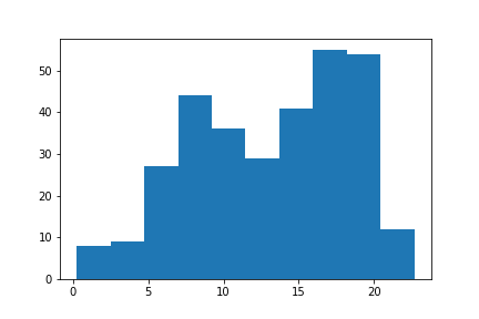
The base of a visualization in matplotlib is a [Figure](https://matplotlib.org/api/_as_gen/matplotlib.figure.Figure.html) object. Contained within each Figure will be one or more [Axes](https://matplotlib.org/api/axes_api.html) objects, each Axes object containing a number of other elements that represent each plot. In the earliest examples, these objects have been created implicitly. Let's say that the following expression is run inside a Jupyter notebook to create a histogram:
```python
plt.hist(data = df, x = 'num_var')
```
Since we don't have a Figure area to plot inside, Python first creates a Figure object. And since the Figure doesn't start with any Axes to draw the histogram onto, an Axes object is created inside the Figure. Finally, the histogram is drawn within that Axes.
[](https://classroom.udacity.com/nanodegrees/nd002/parts/9f7e8991-8bfb-4103-8307-3b6f93f0ecc7/modules/1dc09d28-5703-493c-aab5-a418b8bfa3e1/lessons/b86503df-e416-4f0e-9e2d-a7a3c08d0bc3/concepts/83335e78-7d71-423b-84a9-f47cdf64c0f9#)
This hierarchy of objects is useful to know about so that we can take more control over the layout and aesthetics of our plots. One alternative way we could have created the histogram is to explicitly set up the Figure and Axes like this:
```python
fig = plt.figure()
ax = fig.add_axes([.125, .125, .775, .755])
ax.hist(data = df, x = 'num_var')
```
[`figure()`](https://matplotlib.org/api/_as_gen/matplotlib.pyplot.figure.html) creates a new Figure object, a reference to which has been stored in the variable `fig`. One of the Figure methods is [`.add_axes()`](https://matplotlib.org/api/_as_gen/matplotlib.figure.Figure.html#matplotlib.figure.Figure.add_axes), which creates a new Axes object in the Figure. The method requires one list as argument specifying the dimensions of the Axes: the first two elements of the list the position of the lower-left hand corner of the Axes (in this case one quarter of the way from the lower-left corner of the Figure) and the last two elements specifying the Axes width and height, respectively. We refer to the Axes in the variable `ax`. Finally, we use the Axes method [`.hist()`](https://matplotlib.org/api/_as_gen/matplotlib.axes.Axes.hist.html#matplotlib.axes.Axes.hist) just like we did before with `plt.hist()`
.[](https://classroom.udacity.com/nanodegrees/nd002/parts/9f7e8991-8bfb-4103-8307-3b6f93f0ecc7/modules/1dc09d28-5703-493c-aab5-a418b8bfa3e1/lessons/b86503df-e416-4f0e-9e2d-a7a3c08d0bc3/concepts/83335e78-7d71-423b-84a9-f47cdf64c0f9#)
[This plot is just like the first histogram on the Histograms page.](https://classroom.udacity.com/nanodegrees/nd002/parts/9f7e8991-8bfb-4103-8307-3b6f93f0ecc7/modules/1dc09d28-5703-493c-aab5-a418b8bfa3e1/lessons/b86503df-e416-4f0e-9e2d-a7a3c08d0bc3/concepts/83335e78-7d71-423b-84a9-f47cdf64c0f9#)
To use Axes objects with seaborn, seaborn functions usually have an "ax" parameter to specify upon which Axes a plot will be drawn.
```python
fig = plt.figure()
ax = fig.add_axes([.125, .125, .775, .755])
base_color = sb.color_palette()[0]
sb.countplot(data = df, x = 'cat_var', color = base_color, ax = ax)
```
[](https://classroom.udacity.com/nanodegrees/nd002/parts/9f7e8991-8bfb-4103-8307-3b6f93f0ecc7/modules/1dc09d28-5703-493c-aab5-a418b8bfa3e1/lessons/b86503df-e416-4f0e-9e2d-a7a3c08d0bc3/concepts/83335e78-7d71-423b-84a9-f47cdf64c0f9#)
[This is the same as the second plot on the Bar Charts page.](https://classroom.udacity.com/nanodegrees/nd002/parts/9f7e8991-8bfb-4103-8307-3b6f93f0ecc7/modules/1dc09d28-5703-493c-aab5-a418b8bfa3e1/lessons/b86503df-e416-4f0e-9e2d-a7a3c08d0bc3/concepts/83335e78-7d71-423b-84a9-f47cdf64c0f9#)
In the above two cases, there was no purpose to explicitly go through the Figure and Axes creation steps. And indeed, in most cases, you can just use the basic matplotlib and seaborn functions as is. Each function targets a Figure or Axes, and they'll automatically target the most recent Figure or Axes worked with. As an example of this, let's review in detail how [`subplot()`](https://matplotlib.org/api/_as_gen/matplotlib.pyplot.subplot.html) was used on the Histograms page:
```python
plt.figure(figsize = [10, 5]) # larger figure size for subplots
# example of somewhat too-large bin size
plt.subplot(1, 2, 1) # 1 row, 2 cols, subplot 1
bin_edges = np.arange(0, df['num_var'].max()+4, 4)
plt.hist(data = df, x = 'num_var', bins = bin_edges)
# example of somewhat too-small bin size
plt.subplot(1, 2, 2) # 1 row, 2 cols, subplot 2
bin_edges = np.arange(0, df['num_var'].max()+1/4, 1/4)
plt.hist(data = df, x = 'num_var', bins = bin_edges)
```
[](https://classroom.udacity.com/nanodegrees/nd002/parts/9f7e8991-8bfb-4103-8307-3b6f93f0ecc7/modules/1dc09d28-5703-493c-aab5-a418b8bfa3e1/lessons/b86503df-e416-4f0e-9e2d-a7a3c08d0bc3/concepts/83335e78-7d71-423b-84a9-f47cdf64c0f9#)
First of all, `plt.figure(figsize = [10, 5])`creates a new Figure, with the "figsize" argument setting the width and height of the overall figure to 10 inches by 5 inches, respectively. Even if we don't assign any variable to return the function's output, Python will still implicitly know that further plotting calls that need a Figure will refer to that Figure as the active one.
Then, `plt.subplot(1, 2, 1)` creates a new Axes in our Figure, its size determined by the `subplot()`function arguments. The first two arguments says to divide the figure into one row and two columns, and the third argument says to create a new Axes in the first slot. Slots are numbered from left to right in rows from top to bottom. Note in particular that the index numbers start at 1 (rather than the usual Python indexing starting from 0). (You'll see the indexing a little better in the example at the end of the page.) Again, Python will implicitly set that Axes as the current Axes, so when the `plt.hist()` call comes, the histogram is plotted in the left-side subplot.
Finally, `plt.subplot(1, 2, 2)` creates a new Axes in the second subplot slot, and sets that one as the current Axes. Thus, when the next `plt.hist()` call comes, the histogram gets drawn in the right-side subplot.
### Additional Techniques
To close this page, we'll quickly run through a few other ways of dealing with Axes and subplots. The techniques above should suffice for basic plot creation, but you might want to keep the following in the back of your mind as additional tools to break out as needed.
If you don't assign Axes objects as they're created, you can retrieve the current Axes using [`ax = plt.gca()`](https://matplotlib.org/api/_as_gen/matplotlib.pyplot.gca.html), or you can get a list of all Axes in a Figure `fig` by using [`axes = fig.get_axes()`](https://matplotlib.org/api/_as_gen/matplotlib.figure.Figure.html#matplotlib.figure.Figure.get_axes). As for creating subplots, you can use [`fig.add_subplot()`](https://matplotlib.org/api/_as_gen/matplotlib.figure.Figure.html#matplotlib.figure.Figure.add_subplot) in the same way as `plt.subplot()` above. If you already know that you're going to be creating a bunch of subplots, you can use the [`plt.subplots()`](https://matplotlib.org/api/_as_gen/matplotlib.pyplot.subplots.html)function:
```python
fig, axes = plt.subplots(3, 4) # grid of 3x4 subplots
axes = axes.flatten() # reshape from 3x4 array into 12-element vector
for i in range(12):
plt.sca(axes[i]) # set the current Axes
plt.text(0.5, 0.5, i+1) # print conventional subplot index number to middle of Axes
```
As a special note for the text, the Axes limits are \[0,1] on each Axes by default, and we increment the iterator counter `i` by 1 to get the subplot index, if we were creating the subplots through `subplot()`. (Reference: [`plt.sca()`](https://matplotlib.org/api/_as_gen/matplotlib.pyplot.sca.html), [`plt.text()`](https://matplotlib.org/api/_as_gen/matplotlib.pyplot.text.html))
[](https://classroom.udacity.com/nanodegrees/nd002/parts/9f7e8991-8bfb-4103-8307-3b6f93f0ecc7/modules/1dc09d28-5703-493c-aab5-a418b8bfa3e1/lessons/b86503df-e416-4f0e-9e2d-a7a3c08d0bc3/concepts/83335e78-7d71-423b-84a9-f47cdf64c0f9#)
### Documentation
Documentation pages for Figure and Axes objects are linked below. Note that they're pretty dense, so I don't suggest reading them until you need to dig down deeper and override matplotlib or seaborn's default behavior. Even then, they *are* just reference pages, so they're better for skimming or searching in case other internet resources don't provide enough detail.
* [Figure](https://matplotlib.org/api/_as_gen/matplotlib.figure.Figure.html)
* [Axes](https://matplotlib.org/api/axes_api.html)